A WORLD OF COLOR: LINDSEY CORAL HARPER DESIGNS A CHIC LIVING ROOM VIGNETTE FOR LEE JOFA

Photos courtesy of Lindsey Harper
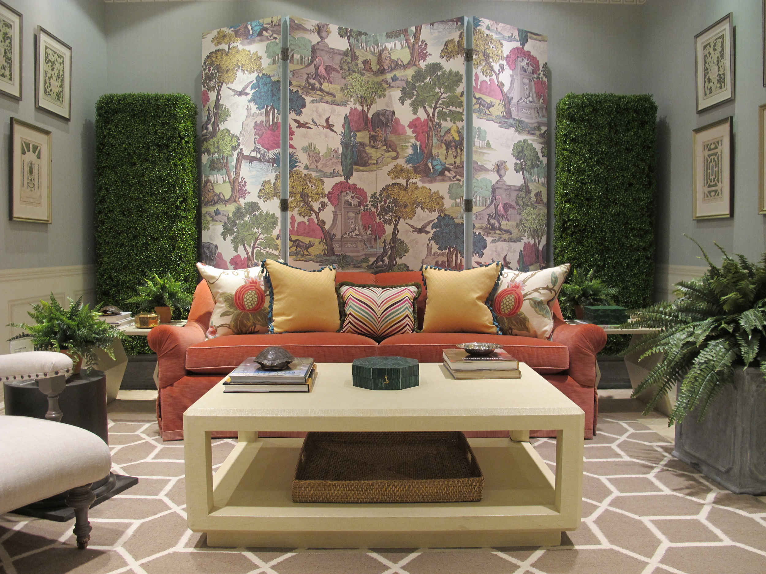
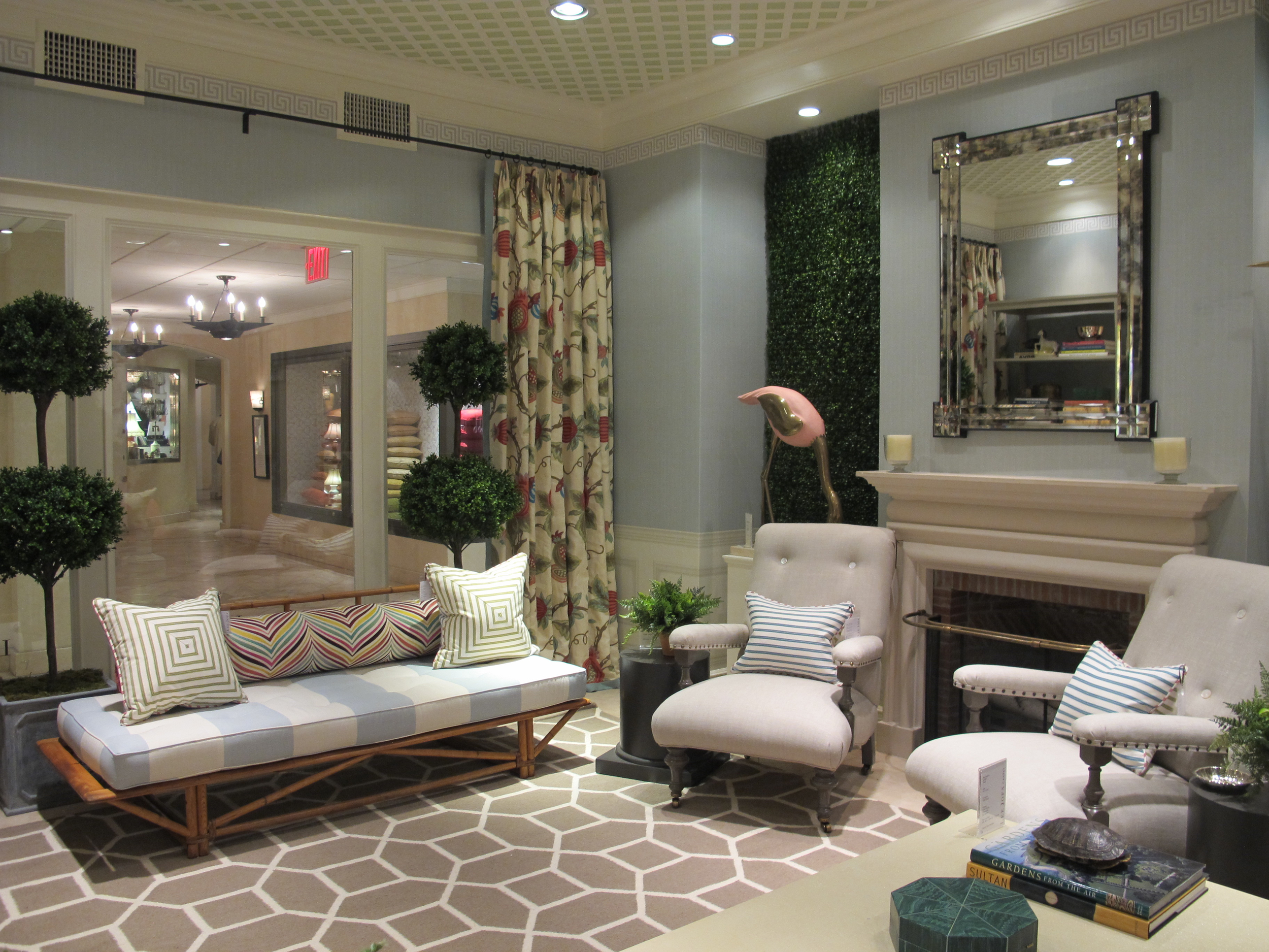
Lindsey Coral Harper was recently asked by Lee Jofa to design the space in the front of their New York Showroom. Pairing a unique color palette pulled from a dramatic scenic wallpaper, she has created a festive and visually engaging living room with a peachy velvet sofa, aqua blue awning stripe-covered bench and assorted bright multi-colored throw pillows. Realizing the tremendous visual impact of adding a touch of green, two giant faux boxwood hedges flank the vibrant wallpaper-covered screen and also flank another focal point, the fireplace, and ferns dominate. Step into Harper's colorful world, filled with vintage accessories, one spectacular set of oversized flamingos and genteel decor touches. What could be more welcoming than a place where the house drink could easily be summery Southsides? Find out what design elements she loves, and how she pulls together her color-filled fun, neo trad interiors.
How would you describe your design style and how has it evolved over time?
I think of my work as clean traditional. I like classic elements yet; I enjoy a less traditional color palette. I like to mix and match. I certainly prefer contemporary art and more modern lighting. I love to layer. How has my design style evolved…its hard to say but, hopefully it gets better with age. I try to push myself creatively a little more all the time, to think outside the box.
What did your mentor, Richard Keith Langham teach you that you still think of to this day?
Wow, that is a very big question. I learned just about everything from (Richard Keith Langham). He taught me so much about scale and proportion and how to work with color. I certainly learned how to finish a room. He drove that home at every installation. It really makes a difference to have each room “photo ready.”
What was the first thing you decided would drive the scheme of this room?
The Versailles Grand wallpaper, the colors are so vibrant and eye-catching. I decided to apply it to a screen to create a focal point that is not too overwhelming.
You work in a really interesting color palette, including off color combinations that are unexpected and beautiful. Tell us about how you approached the colors here and what you worked with? Did the screen fabric lead the palette?
I love the unexpected! I knew the screen would be the focal point initially, and it has a lot of bright punchy colors. I love to use wallpaper and I thought aqua on the walls would be great, but how interesting to add another layer with the tromp l’oeil paneling. Next I selected all of the prints and woven patterns that worked well with the paper, the curtain fabric and that fun multi-colored zigzag you see on the bolster. I of course tied in some solids to balance it all.
What are elements people have come to expect in your work?
Color, pattern, comfort, maybe a little bit of Southern charm….
How do you approach each project from a color and pattern standpoint? What do you think is the most important thing to bear in mind when looking at a room at the start and where it will end up?
My job is to maximize the potential of any room. It’s so much fun to make something from nothing. Bear in mind you need to respect the entire room…all the elements add up for a finished look. Don’t forget or neglect parts of the room…like the ceiling, the shelves, or the hardware and certainly not the art or accessories!

Comfortable seating is key. How did you pick the furniture and what is the trick to comfort in a living room? What are the necessary elements to include?
I picked a beautiful sofa silhouette from Lee Jofa. Then I added the deep armchairs to flank the fireplace. The chairs are open and airy and do not overwhelm the space. I think rooms should be comfortable so they can be lived in. A sofa is always a great investment, and if you purchase a well made one they can be passed down and reupholstered for years.

You have a penchant for vintage inspired pieces in your work. What do you look for on the vintage hunt, and how do you get disparate things to work together, or what is the common thread that makes it all go together?
I like interesting objet, something that grabs my attention. Maybe it is the of the shape or color that interests me. Sometimes it’s just something cheeky that makes me laugh. I think rooms should have a personality; this is where the accessories often come in.
All of the upholstery save for the awning stripe on the bench is solid. Does that make it easier to live with pieces as they can be moved from room to room? You worked with patterns in the pillows, what advice do you have on working with prints and patterns as to not overwhelm and mix well together?
The key is balance when you are mixing prints and patterns. Of course starting with a solid and layering your patterns on top in smaller doses almost always works. I used solids on the chairs and sofa, but I also used a lot of pattern everywhere else, on the curtains, all of the pillows and the backs of the chairs, even the carpet is a pattern. So the trick was balance.
I see you didn't neglect the 5th wall, also known as the ceiling. What does lattice do when used on a ceiling versus walls?
By painting the ceiling a soft shade of green and adding the lattice on top, it adds another layer to the room. It gives the room a little more dimension.

The final layer, the accessories, is often overlooked. They add personality and the human touch. What are your favorite types of accessories to use and why?
How great are those birds?! And to think I found them through Instagram. I love a good junk store, a thrift store, a tag sale…a consignment shop. I love beautiful objet and really quirky tongue-in-cheek items. After all decorating should be FUN!